Brand Dissection: Hopworks Urban Brewery
This is the second part of what I hope will be an ongoing series of brand dissections. For an introduction to the idea behind the series, have a look at this post. Last time, I looked at Rogue Ales, and one of the consistent comments was "I hope you look at smaller breweries, too." So this time I thought I'd look at one of the most distinctively branded brewpubs in Portland, Hopworks Urban Brewery.
Background
Christian Ettinger founded Hopworks just about two years ago. He had already logged over a decade in the brewing business, though, and so he'd put a lot of thought into what the new place would look like.
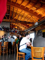 Brewpubs have a physical presence that anchors the brand. When you walk into hopworks, the sense of an architecturally intentional identity is obvious instantly. For me, structural design underscores everything Hopworks does. (It's instructive that the beer was ready long before the building. Brewpubs often emphasize the dining space, focusing on the diners' experience. Hopworks reverses that; diners are put in the brewery's space--you feel the sense of the whole no matter where you are in the building.)
Other elements of the physical space jump out, too: the bicycle frames that extend like ribwork (or buttresses) above the bar; a large round window in a corner of the pub; pony kegs sliced in half to create planters. The pub boasts of a green, organic ethos and yet is in an entirely industrial context.
Elements of the Brand
These disparate elements are not random. Ettinger had a series of influences he was trying to incorporate into the design. Working with a graphic artist, they decided that the three elements of the brand would be colors, font, and a logo. They should all be distinctive so that if you used one in isolation, it would still instantly communicate the Hopworks brand.
Logo
The element Ettinger calls the logo is the sun/target circle image behind the name. Although it's the least distinctive of the three elements, in many ways, it is the thing that for Ettinger most represents the brewery.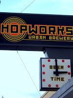 What you see in the physical pub Ettinger sees in the circles:
For me, most memorable element is the font. I always related to it as an echo of the architectural themes. It's blocky, like wood or buildings. The lines are square rather than round, which suggested the German influence. But in fact, the font is--like Rogue's symbolism--from the iconic socialist era.
Colors
Another element of the Hopworks brand is the 1970s. That large circular window, the banana bicycle seats in the men's bathroom (I can't speak for the women's!), and the colors. I find all of these suggestive of the colors and shapes that surrounded me growing up. I think Ettinger is roughly my same age, and I wonder if this isn't a bit of Gen X influence. Here's Christian describing the color palette:
I forgot to ask Christian about the name, but at this point it seems self-evident. "Hopworks" was almost an inevitable name--it's so good that eventually some brewery was going to run with it. But Ettinger added the "Urban Brewery" which stand as useful qualifiers, but also--and this is ultimately the point--allow him to use the acronym "HUB." The idea of the hub is perfectly in keeping with the idea of circularity, of integration, and of community that Ettinger mentioned as we started. HUB is mainly used in visual representation. Verbally, "HUB" pitches you into confusion; Hopworks is far better as a communication of location.
Brand Success
Brewpubs don't always have the same level of attention to brand that production breweries necessarily must. I started with Hopworks because I find it to be such a strange and potent cocktail of brand elements. With a strong brand, you are actually influenced in the way your relate to not only the pub, but the beer. "Brand" has a negative connotation with some folks, but if you think of it as "personality" instead, you get a sense of its effect. Hopworks communicates its personality on a number of levels, some subtle, some obvious, and I was pleased to learn that the intention behind the brand is consonant with how I relate to the brewery. That seems like the final mark of success: does the brand communicate what you want it to? (It's slightly different from "does the brand make you like the product?"--which is almost impossible to engineer.) By this definition, Hopworks nailed it.
____________
PHOTO: HUB cap by Drinks with Nathan. | Share
Background
Christian Ettinger founded Hopworks just about two years ago. He had already logged over a decade in the brewing business, though, and so he'd put a lot of thought into what the new place would look like.
"Being the son of an architect, a German architect at that, who was very image-oriented in terms of quality and design and the function that follows—so it was never good or better, it was always 'best.' I spent my childhood touring architectural wonders around the country. That was our vacations, going to see the Guggenheim and Taliesin. So a heavy design influence early on. And also the German, anal-retentiveness, where you always seek for that perfection; knowing you never quite get there, but knowing that there is something better than what everyone else is doing, you just gotta find it."There's a big difference between a production brewery and a brewpub.
Brewpubs have a physical presence that anchors the brand. When you walk into hopworks, the sense of an architecturally intentional identity is obvious instantly. For me, structural design underscores everything Hopworks does. (It's instructive that the beer was ready long before the building. Brewpubs often emphasize the dining space, focusing on the diners' experience. Hopworks reverses that; diners are put in the brewery's space--you feel the sense of the whole no matter where you are in the building.)Other elements of the physical space jump out, too: the bicycle frames that extend like ribwork (or buttresses) above the bar; a large round window in a corner of the pub; pony kegs sliced in half to create planters. The pub boasts of a green, organic ethos and yet is in an entirely industrial context.
Elements of the Brand
These disparate elements are not random. Ettinger had a series of influences he was trying to incorporate into the design. Working with a graphic artist, they decided that the three elements of the brand would be colors, font, and a logo. They should all be distinctive so that if you used one in isolation, it would still instantly communicate the Hopworks brand.
Logo
The element Ettinger calls the logo is the sun/target circle image behind the name. Although it's the least distinctive of the three elements, in many ways, it is the thing that for Ettinger most represents the brewery.
What you see in the physical pub Ettinger sees in the circles:"You have all these circular things which are very literally translated into: the cycle of life, oxygen-nitrogen cycle, all these different things that are responsible for life and the health of those different systems we all rely on. Agriculture. So the circle just kept popping up—the bicycle wheel, the cog, all these industrial things, a keg of beer on its side. You’re always returning to the same point, but it’s the journey.Font
For me, most memorable element is the font. I always related to it as an echo of the architectural themes. It's blocky, like wood or buildings. The lines are square rather than round, which suggested the German influence. But in fact, the font is--like Rogue's symbolism--from the iconic socialist era.
"We were looking at these Russian Constructivist design books. I like the working-class elements that are present, and the bold use of colors and the very angular and industrial [lines]. Living in Germany in ’93 just after the wall came down and being able to walk through East Berlin and seeing just what it looked like. That drab, post-communist look. I guess it spoke to me."Hopworks has a brand that works in contrasts--a reflection of Ettinger's style. You see it through the brewery, and you see it in the circle logo and the square font. Small breweries have an advantage over large ones: they are free to communicate specific identities that will appeal to some people and leave others cold. Hopworks' font is a great example. It's bold and memorable. It's not the kind of font that appeals to me, but it's effective at communicating brand and sticking in my memory. I can see a row of 22s and spot Hopworks from 20 feet--just because I can see that font.
Colors
Another element of the Hopworks brand is the 1970s. That large circular window, the banana bicycle seats in the men's bathroom (I can't speak for the women's!), and the colors. I find all of these suggestive of the colors and shapes that surrounded me growing up. I think Ettinger is roughly my same age, and I wonder if this isn't a bit of Gen X influence. Here's Christian describing the color palette:
"The colors are very warm and sunny, you’ve got orange and red—or how you look at it, kind of marigold, kind of yellow-orange and reddish orange as well. And also high-contrast; you’ve got that black to anchor you. I love high contrast"Name
I forgot to ask Christian about the name, but at this point it seems self-evident.
"Hopworks" was almost an inevitable name--it's so good that eventually some brewery was going to run with it. But Ettinger added the "Urban Brewery" which stand as useful qualifiers, but also--and this is ultimately the point--allow him to use the acronym "HUB." The idea of the hub is perfectly in keeping with the idea of circularity, of integration, and of community that Ettinger mentioned as we started. HUB is mainly used in visual representation. Verbally, "HUB" pitches you into confusion; Hopworks is far better as a communication of location.Brand Success
Brewpubs don't always have the same level of attention to brand that production breweries necessarily must. I started with Hopworks because I find it to be such a strange and potent cocktail of brand elements. With a strong brand, you are actually influenced in the way your relate to not only the pub, but the beer. "Brand" has a negative connotation with some folks, but if you think of it as "personality" instead, you get a sense of its effect. Hopworks communicates its personality on a number of levels, some subtle, some obvious, and I was pleased to learn that the intention behind the brand is consonant with how I relate to the brewery. That seems like the final mark of success: does the brand communicate what you want it to? (It's slightly different from "does the brand make you like the product?"--which is almost impossible to engineer.) By this definition, Hopworks nailed it.
____________
PHOTO: HUB cap by Drinks with Nathan. | Share