Brand Dissection: Rogue Ales
For the first installment of the brand dissection series (introduction here), we turn to Rogue Ales--the original inspiration. Yet it makes sense to start with Rogue in any case, because no other brewery in the Northwest has had such a consistent sense of its own brand, nor been more focused on maintaining their brand.
This shouldn't be too surprising. Jack Joyce and other founders of Rogue came from the shoe industry and their focus from the start was to build a brand around their new brewery. Here's Rogue President Brett Joyce, whom I spoke to for this piece.
"Understand that we began with our founders being a handful of ex-Nike and Adidas executives. So we didn't come into this thing with any experience at all in the beer business.... We always looked at the the brand first, the brand second, and the brand third--and the business fourth; the business as a secondary item.
We always had the notion that if you have a great brand--and you have a great product--then your chances of succeeding as a business were pretty good."
Background
Although Rogue started in Ashland, the name isn't an allusion to the Rogue River (although Brett did concur that this gave it a nice resonance). It was actually a nickname of Jack's, earned when he was still at Nike. It seemed like a good fit for what the company wanted to communicate: Rogue Ales would be a beer-business revolutionary, effectively kryptonite to cheap beer. From the start, they have highlighted everything that contrasts with national tin-can beer: a focus on beer geekery (stats on the bottle), the best ingredients (which led them to buy crop land for hops and barley), a sprawling variety of products (as opposed to sameness of national brands), and emphasis of rarity and luxury. Even the "Ales" in the name underscores this point, highlighting the focus on ales, but also placing the revolution in the bottle, not in the company HQ. I view Rogue's self-image as one of a pirate ship careening around the country, trying to set its flag in the deepest reaches of Bud country.
Elements of the Brand
Rogue communicates their brand through several modes.
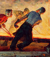
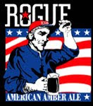
Visually, you could call their presentation "luxurious revolution." The cues here seem to conflict, but keep in mind that the revolution isn't about politics, but about the beer biz. Sometime in the past decade or so, Rogue shifted their design to highlight the revolution through overtly socialist/communist symbolism. The art style is socialist realism, popularized during the cold war when the Soviets used art to support the revolution. It tends to focus on the strength and glory of the worker. Rogue, using these themes, features a variety of muscular men on the labels--a nod to the steel workers and farmers the Soviets employed.
But Rogue doesn't stop at allusion. They also incorporate overtly communist symbols: the red star and the upraised fist. The star appears everywhere, and if you look carefully, you'll notice that it's always the left fist that comes up--a particular Trostkyite flavor.
Interestingly, Rogue also sends many signals about how expensive and luxurious their beer is. Although you can buy some of their beers in sixers, Rogue has always favored the silk-screened 22-ounce bottle. Silk-screening is a special treatment, and it sends the message that this is a rare treat--and the bottle is a nice souvenir. In addition to the regular line-up, Rogue also has their XS series, sold in silk-screened, swing-top ceramic bottles. (Rogue's in the process of going back to 7-ounce bottles for this series, a practice they used in the 90s, but the message of rarity and luxury will still shine through.)
In addition to the visual cues, Rogue has always priced their beer above most other brands--another symbol of the beer's status as a rare luxury. Nike has been famous for this strategy for decades, and it seems to have been part of Rogue's from the start. In the context of the communist iconography, this seems strange, but of course, Rogue's revolution is aimed at cheap beer, not the Man.
The final element of the brand is the idea of "Rogue Nation," which takes a page from the political branding playbook. As politicos know, it's a lot easier to run against a candidate than a movement. With Rogue Nation, the company has pretty effectively given their brand a movement component. With "citizenship," customers are offered a variety of insidery benefits which, not surprisingly, go to underscore the brand. Customers are fickle; citizens are loyal. With Rogue Nation, the company is saying, "Come board our pirate ship!"
Brand Health
Rogue's been around 22 years. It's hard to sustain a revolution for decades; pirates can only stay on the outside so long before they get absorbed. In the past few years, we've seen some local blowback to the brand. In a part of the country where there are so many craft breweries, so many alternatives to tin-can beer, Rogue's revolution doesn't seem so unique. The beer prices are high and in the proliferating pubs, they're even higher. Everytime I post something about Rogue, I get about equal parts resentment and admiration. My sense is that this is not nearly the case in other parts of the country, where Rogue is an exotic visitor--but it is still a concern for a company that very much wants to be a successful national brand.
However, Rogue isn't standing still. They've added spirits to their product line, expanding the brand beyond beer, while still remaining true to it. Their foray into agriculture is particularly promising. As the beer world shifts to local and organic, Rogue is primed to lead the way. (Though the "chatoe" and "dirtoir" names seem like obvious misfires to me. Rogue's customers have no animus toward wine culture--and perhaps no awareness of it. "Dirtoir"--does the average beer drinker understand terroir? Here the pirate ship has targeted an unnecessary foe.)
I will also tip my hat to their work on the Green Dragon. For a company so strongly branded, it must have been murder not to Rogue-ize the new place. While it's true that the food is less spectacular and more expensive, I find it remarkable to see a company bury its own identity in order to create something new. As one contrasting example, when Starbucks bought the far superior Torrefazione Italia, they could only manage to preserve Torrefazione's identity for a short while. Within months they had turned these outlets into bland, mass-consumption Starbucks. That Rogue is willing to experiment and try extending its reach beyond its immediate brand seems to bode well for their future success.
Since I know a number of people will be reading this who have experience in both the beer business and in branding, I look forward to hearing your take on Rogue. What'd I miss?
______________
ART: detail "Young Steelworkers," Ivan Bevzenko (Ukraine), 1961. Courtesy Marxists.org.