Brand Dissection: Ninkasi Brewing
In the fifth part of this ongoing series, I consider Ninkasi Brewing's brand. If you want to read previous editions, follow this link.
Background
Ninkasi has only been around since 2006, but it's already become one of the state's larger breweries. Co-founder Jamie Floyd was not new to either brewing or brewing in Eugene, having been with Steelhead for years before opening Ninkasi. (The other co-founder, Nikos Ridge, has a background in finance.) Floyd calls their approach the "Chico strategy" (after Sierra Nevada) to become the city beer of a smaller community and expand from there. Check. Now Ninkasi is expanding out, and actually sells more beer in Portland than Eugene. The brewery just installed a new 60- barrell system and has a new bottling line and lots and lots of capacity to grow.
The Name
Ninkasi is an obvious choice--so obvious I was amazed Floyd found it free of trademark. The name refers to the ancient Sumerian goddess of brewing, documented in a famous 4000-year-old hymn. But surely someone had already snatched it up? Someone had--Fritz Maytag, whose Anchor Brewery had used it for their Sumerian Beer Project. But, over the course of 15 years, the mark expired, and Floyd and Ridge were the first ones to discover its availability. It's a classic name, like Gambrinus, the patron saint of brewing. Interestingly, Floyd says it has the dual virtue of still being slightly obscure ("a lot of people think it's Japanese")--familiarity to beer geeks, intrigue to those outside the loop.
Elements of the Brand
Back when I first started writing about beer, BridgePort had just changed their line-up from the old, iconic nature labels to one of consistent brand identity. A PR woman told me at the time that they wanted to get away from beer branding to brand branding. The idea was that people would just order a "BridgePort," ignoring the style of beer. It alerted me to just how hard that is. Breweries are known for certain beers--rarely does the brand permeate the full line-up. With Ninkasi, that's not true.
Everyone knows what Ninkasi beer is: hoppy. There are variations on a theme, but most of the core lineup features pale beers of vibrant hoppiness. For this, Ninkasi has earned the enmity of some beer geeks (a minority), but from a branding point of view, it's impressive and rare. You can just order a Ninkasi and have a good idea of what you'll get. (When I visited the brewery last week, they had a Berliner Weisse on draft at the tap room, and Floyd agreed with a laugh when I said I bet his customers were shocked when they tasted it.) This may not be the direction every brewery wants to go, but for Ninkasi it works: they're delighted to be known as the hophead's beer.
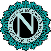
Logo
Interestingly, Floyd and Ridge decided not to use goddess iconography. There's no visual reference to the goddess, just the name. Instead, the logo is a starburst pattern surrounding the Ninkasi "N."
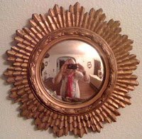
"The logo itself is based on an Egyptian revival mirror that used to hang in my house. All the original branding was done by me and my ex-wife [Brianna Jackson]. She's a graphic artist by profession and so we created a lot of that stuff together. We wanted something that was modern but timeless and had a Middle Eastern feel to it. It said a lot without really having to say a lot."
The rays of the logo are echoed in some of the labels as well--Radiant and Maiden the Shade. Although Floyd didn't mention it, this seems like a nod--perhaps unconscious--to the crunchy vibe of Eugene. There's a strong streak of tie-dye running through the city, and Ninkasi channels it in subtle ways.
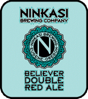
Colors
Since Ninkasi doesn't do images, the brand relies on colors. Each label has a strong, clear field--almost like a flag--which is pretty much the only thing that distinguishes one beer from another. This intentionally stark scheme emerged as a way for customers to distinguish beers by looking at the tap handle, and Floyd likes the way it makes Ninkasi stand out on grocery shelves, too: "But when you walk up to look at a row of bottles, you see a blur of things, they don’t come out. In some cases our beers are next to each other, and in some cases they are separated by style--so it's easy to identify them." (I can speak to how easy they are to spot, too; I'm colorblind, and a lot of colors are muddy and indistinct--Ninkasi's have pure, saturated colors.)
Music
Two of the beers are homages to heavy metal bands--which I've already written about (Maiden the Shade and Sleigh'r). I have wondered what this says about the brewery's tastes, and Floyd confessed that there were lots of resident metalheads there. But even these are part of the brand--Ninkasi has a side interest in promoting local bands and has even toyed with the idea of producing music. (Apparently they're big supporters of music in Boise, Idaho--which based on my youth there, could use it.)
Interestingly, the first beer Floyd ever brewed (at Steelhead) was called Starchild for the messiah figure in Parliament Funkadelic's mythology. So the link to music goes way back. Let me be the first to request that Dr. Hoppenstein be the next homage--funk's far cooler than metal. (Take it up in comments.)
Brand Success
Ninkasi's brand is consistent and distinctive, two clear markers of success. You don't mistake a Ninkasi label on a grocery shelf. But brands also reflect a company's identity, and the Ninkasi brand does a good job here, too. Ask ten beer fans what they think of Ninkasi, and I doubt you'll get a neutral opinion from more than one. The brewery knows what it's doing, and it doesn't wander in the weeds searching for direction. The brand is similarly confident and direct. I don't doubt that there are some who don't like it, but everyone recognizes it. In an increasingly crowded field, that's maybe the most important sign of success.