Cans
Cans are ugly.
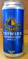 This is one of those thoughts that passed through my mind as I poured out the latest tinned offering, Pyramid Hefeweizen, which the brewery thoughtfully sent to me last week. Bottles can be ugly, but they are not innately so. The lines of the standard bottle are pleasing, and label art has the ability to instantly attract the eye. Bottles can be shaped to suit a brewery, with long, elegant necks like Pacifico sports, or short, squat bodies as in Session Lager. They may be embossed with logos or come in different colors.
Cans, on the other hand, are purely industrial and come in one shape. Metal, though it does occur naturally, has the least natural feel of any material. Its cold, impersonal color is impossible to conceal. The colors seem to wash out on aluminum and often the printing isn't exact. No m atter how they're designed, there's always a segment of the can that has small print, which further erodes any elegance a designer may try to impose. No matter how clever the design, a can looks industrial and communicates chemistry, not art.
(Stipulated: cans are actually better in many respects than glass. They are lightweight, recyclable, and have a smaller carbon footprint than glass. Beer in cans cannot be light-struck. )
And finally, no matter how hard I try, I cannot look at a can of beer and not see a halo of all the cheap beers of my past. This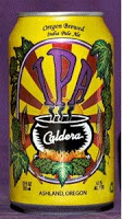 is a cultural artifact and may well diminish for future generation. For graybeards, though, the brain has to do a stutter step every time the eyes take in a canned craft beer. We have reified the can, freighting it with the meaning and emotion of "cheap" and "gross." Our old creaky software must find the patch which clarifies matters: "nope, the Caldera's good," we remind ourselves.
Canning is good and I'll get behind it. But I'm never going to come around to think the can is an attractive package.
______________
Share
This is one of those thoughts that passed through my mind as I poured out the latest tinned offering, Pyramid Hefeweizen, which the brewery thoughtfully sent to me last week. Bottles can be ugly, but they are not innately so. The lines of the standard bottle are pleasing, and label art has the ability to instantly attract the eye. Bottles can be shaped to suit a brewery, with long, elegant necks like Pacifico sports, or short, squat bodies as in Session Lager. They may be embossed with logos or come in different colors.Cans, on the other hand, are purely industrial and come in one shape. Metal, though it does occur naturally, has the least natural feel of any material. Its cold, impersonal color is impossible to conceal. The colors seem to wash out on aluminum and often the printing isn't exact. No m
atter how they're designed, there's always a segment of the can that has small print, which further erodes any elegance a designer may try to impose. No matter how clever the design, a can looks industrial and communicates chemistry, not art.(Stipulated: cans are actually better in many respects than glass. They are lightweight, recyclable, and have a smaller carbon footprint than glass. Beer in cans cannot be light-struck. )
And finally, no matter how hard I try, I cannot look at a can of beer and not see a halo of all the cheap beers of my past. This
is a cultural artifact and may well diminish for future generation. For graybeards, though, the brain has to do a stutter step every time the eyes take in a canned craft beer. We have reified the can, freighting it with the meaning and emotion of "cheap" and "gross." Our old creaky software must find the patch which clarifies matters: "nope, the Caldera's good," we remind ourselves.Canning is good and I'll get behind it. But I'm never going to come around to think the can is an attractive package.
______________
Share